The fastest way to raise your ecommerce conversion rate is to fix checkout friction first, then mobile speed, then product-page trust, then build a measurement habit that tells you what actually worked. These four levers account for most of the lost sales on a typical store, and they respond to changes within weeks. Below is a prioritized checklist so you know exactly where to start today.
Key Takeaways
Fixing checkout friction and mobile speed are the fastest ways to significantly improve ecommerce conversion rates within weeks.
| Point | Details |
|---|---|
| Prioritize structural fixes | Address checkout and speed issues first, as they directly impact conversion and can be fixed quickly. |
| Use segmented benchmarks | Compare conversion rates by device, channel, and visitor type to identify specific areas for improvement. |
| Optimize checkout flow | Simplify checkout by offering guest checkout, automatic address lookup, and clear shipping options to reduce abandonment. |
| Focus on mobile speed | Improve mobile page load times by compressing images and removing slow scripts; even small gains boost sales. |
| Leverage trust signals and reviews | Display verified-purchase badges, clear return policies, and authentic reviews to enhance shopper confidence. |
Table of Contents
- Prioritized quick wins you can start today
- What conversion rate means and how to benchmark it
- Fixing checkout flows to recover lost sales
- A practical mobile speed and performance playbook
- Structuring product pages and feeds that convert
- Using reviews and trust signals without legal risk
- Building a measurement and testing framework that holds up
- Turning one-time buyers into repeat customers
- How we help small ecommerce sites fix these levers fast
- What most stores get wrong about conversion optimization
- Start with an audit, then a focused sprint
- FAQ
- Sources
Prioritized quick wins you can start today
Not every fix deserves equal attention. Some take an afternoon and move the needle immediately; others need a quarter of development time. Sorting your to-do list by effort against impact keeps you from polishing a button color while your checkout form bleeds customers.
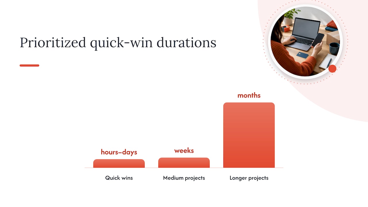
Quick wins (hours to days):
- Audit your checkout funnel in analytics to find the exact step where shoppers quit.
- Turn on guest checkout if it is not already the default path.
- Add automatic address lookup so shoppers never retype a full mailing address.
- Compress and resize product images; swap any file over 200 KB for an optimized version.
- Lazy-load images below the fold so the first screen loads fast.
- Trim your homepage hero section to one clear offer and one clear action.
- Display a secure-checkout badge and a plain-language returns policy near the buy button.
- Surface verified-purchase reviews on product pages instead of burying them in a tab.
- Add digital wallet payment options (Apple Pay, Google Pay, PayPal) at checkout.
Medium projects (weeks): rebuild checkout forms to remove nonessential fields, add size or fit guides to product pages, set up a review-request email sequence, and build a performance budget for new pages.
Longer projects (months): full checkout redesign with fulfillment-option visibility, a structured product-feed overhaul for shopping channels, and a segmented A/B testing program with guardrail metrics.
Checkout friction deserves the top slot because of its scale. Baymard’s checkout research finds a global average cart-abandonment rate of 70.19%, and checkout design improvements alone can produce an average 35.26% conversion-rate increase for large ecommerce sites. That single data point explains why checkout fixes sit at the top of nearly every quick-win list: the dollar return per hour of work is usually larger there than anywhere else on the site.
For each item, track one metric and set a simple threshold before you move to the next task. Checkout drop-off rate should fall after guest checkout and address-lookup changes; watch it weekly for a month. Page weight and load time should drop after image compression; confirm with a before-and-after Lighthouse score. Review visibility changes should show up as a small lift in product-page-to-cart rate within two to three weeks. Wallet payment adoption should show in your payment-method breakdown within the first billing cycle after launch.
Pro Tip: Fix the step with the single largest percentage drop-off first, even if it feels less exciting than a redesign. One fixed bottleneck beats five cosmetic tweaks.
The order matters because checkout and speed fixes change the denominator and numerator of your conversion math directly, while trust and persuasion elements influence a shopper who is already close to buying. Spend your first sprint on structural friction, then move to persuasion and retention work once the funnel itself is clean.
What conversion rate means and how to benchmark it
Ecommerce conversion rate is the percentage of visits that end in a purchase: conversions divided by sessions, multiplied by 100. If your store gets 10,000 sessions in a month and records 250 completed orders, your conversion rate is 2.5%. That single number, though, hides more than it reveals when you stop there.
Segment the metric before you judge it:
- By device. Mobile sessions typically convert at a lower rate than desktop, so a blended average can make a healthy desktop funnel look mediocre.
- By channel. Paid search, organic, email, and social traffic carry different intent levels and should be tracked separately.
- By product category. High-consideration purchases convert slower than impulse categories, and averaging them together obscures which pages need work.
- By visitor type. Returning customers almost always convert higher than first-time visitors, so blending the two understates how well you are doing with either group.
Benchmark ranges vary widely by industry, price point, and traffic source, which is why chasing an “ideal” single-digit percentage from an unrelated niche rarely helps. A more useful benchmark is your own-segmented baseline, tracked monthly, compared against itself over time.
Cart abandonment is the other half of the picture. Baymard’s research puts the global average cart-abandonment rate at 70.19%, a figure worth treating as a reminder that most of your “lost” conversions never had a true purchase intent breakdown, they stalled in a process that was harder than it needed to be.
Fixing checkout flows to recover lost sales
Checkout is where intent meets friction, and it is where the clearest, fastest conversion gains usually live. Start by mapping the funnel step by step in your analytics tool: landing on cart, entering shipping, entering payment, reviewing the order, confirming. Whichever step shows the steepest percentage drop is your priority, not the step that feels most outdated.
Baymard’s 2024 checkout research identified more than 1,350 medium-to-severe usability issues across the sites it reviewed, along with over 110 updated guidelines for fixing them, and two problems recur constantly: forced account creation and hidden fulfillment choices. The fixes are concrete:
- Offer guest checkout as the default, with account creation as an optional link, never a gate.
- Defer any required registration until after the order confirms, and explain the benefit (faster reorders, saved addresses, order tracking) rather than demanding a password up front.
- Add automatic address lookup so shoppers select from a validated list instead of typing a full address twice.
- Show every available shipping and fulfillment option clearly on the main checkout screen, not behind a secondary click, since Baymard’s 2024 release flags hidden fulfillment options as a repeated cause of abandonment.
- Allow quantity and variant edits directly from the cart or checkout page without forcing a return to the product page.
- Cut every form field that is not strictly required to ship and bill the order.
Once the structural fixes are live, test the specific wording and layout decisions around them: button copy (“Continue as Guest” versus “Checkout”), the number of steps compressed into one page versus several, and whether a progress indicator reduces or increases perceived effort. Expect checkout-level fixes to move the needle in the range Baymard describes for large sites, though your own result will depend on how broken your current flow is; a store with several of these issues stacked together usually sees a larger jump than one with only a minor friction point.
Pro Tip: Watch your checkout funnel by device separately. A fix that helps desktop completion can sometimes leave a mobile-specific problem, like a cramped address field, completely untouched.
A practical mobile speed and performance playbook
Speed is not a technical nicety, it is a revenue lever with a documented price tag. Google’s analysis of 37 brands and 30 million sessions found that a 0.1-second improvement in mobile page speed correlated with an 8% increase in retail conversion rate. That is a small technical change tied to a measurable commercial outcome, which is exactly the kind of evidence worth acting on before you spend a dollar on new creative.
Measure speed two ways at once. Field data, often called real-user monitoring, comes from your analytics platform and shows what actual shoppers experienced on real connections and devices. Lab data, from tools like WebPageTest or Lighthouse, shows a controlled test you can repeat before and after a change. Pairing both lets you see whether a fix genuinely worked, rather than guessing from an aggregate average that hides device-level problems.
A practical sequence for the next sprint:
- Run a Lighthouse audit on your three highest-traffic pages (home, a top category, a top product) and record the baseline scores.
- Set a performance budget: a maximum page weight and load time your team commits to for any new page or feature.
- Compress and serve responsive images sized to the device requesting them, and lazy-load anything below the first screen.
- Audit third-party scripts (chat widgets, marketing pixels, review plugins) and remove or defer any that are not earning their load time.
- Serve assets through a CDN with HTTP/2 enabled, and simplify DOM structure on pages with heavy nested elements.
- Re-run the same Lighthouse audit and compare it against your baseline, then check conversion rate for the same pages segmented by device over the following month.
Statistic Callout: A 0.1-second mobile speed gain correlated with an 8% lift in retail conversion across the brands Google studied, a reminder that speed work often pays back faster than a full page redesign.
Avoid misattributing a conversion change to speed alone. If you launch a speed fix during a sale period or alongside a pricing change, segment your before-and-after comparison by traffic source and device so you are not crediting a technical fix for a seasonal spike.
Structuring product pages and feeds that convert
A product page has one job: answer every question a shopper would ask before handing over a credit card. That means a clear hero image, scannable benefit bullets above the fold, transparent pricing with shipping cost disclosed before checkout, and a size or fit guide for anything where sizing is a real purchase barrier.
Image strategy deserves more thought than most stores give it. Think with Google’s analysis found that converting mobile sessions had 38% fewer images on average than non-converting sessions, which suggests that a cleaner, faster page often outperforms a visually dense one. Prioritize fewer, well-optimized images over adding more creative assets for their own sake.
Trust compounds through product-level proof:
- Add verified-purchase badges next to reviews so shoppers know the feedback came from an actual buyer.
- Encourage customer photos alongside written reviews; a buyer looking at how a product fits a similar person converts with more confidence than one reading marketing copy alone.
- Keep shipping timelines and return windows stated directly on the product page, not buried in a policy link.
If you sell through shopping feeds or marketplaces, feed governance matters as much as the page itself. Keep price, availability, and active promotions synchronized across every channel; a shopper who clicks through from a search ad to a page showing a different price or an out-of-stock item abandons immediately, and that mismatch damages trust in your brand for the next visit too, so consider a thorough affiliate revenue audit to identify and fix such issues. Google’s retail guidance emphasizes structured, accurate product data as a foundation for discovery, which now extends to AI-assisted shopping tools that read your feed directly.
Using reviews and trust signals without legal risk
Trust signals convert, but only when they are genuine, and the rules around them tightened recently. The practical trust elements worth prioritizing on any store:
- Verified-purchase badges on reviews, so shoppers can tell real feedback from unverified comments.
- A clearly stated, easy-to-find return policy, ideally visible on the product page itself.
- HTTPS across every page, with a visible padlock and no mixed-content warnings.
- A visible support contact, whether that is live chat, a phone number, or a response-time commitment on email.
The FTC’s consumer-review rule, effective since October 2024, prohibits buying or selling fake reviews outright and requires businesses to disclose any material connection behind an endorsement. In practice, that means never offering a reward conditioned on a positive review, never suppressing or hiding negative feedback you are legally required to display, and always disclosing when a reviewer received free product or payment in exchange for their opinion. The FTC’s broader endorsement guidance reinforces the same principle: earned, verifiable trust signals are now a compliance requirement as much as a conversion tactic.
Capture reviews ethically by asking every customer, not a filtered subset, and by timing the request after the product has had time to be used, not immediately at checkout. If you offer an incentive for leaving a review, make it unconditional on sentiment and disclose it plainly.
Pro Tip: Respond publicly to negative reviews instead of hiding them. A calm, specific response often reassures the next shopper more than a page of five-star reviews alone.
Building a measurement and testing framework that holds up
A conversion program without a testing discipline is just a series of guesses with better production values. Before running any test, define a primary metric (usually conversion rate or revenue per session) and at least one guardrail metric, such as average order value or return rate, so you catch a win on one number that quietly damages another.
A workable framework:
- Segment your test by device and traffic source before you launch it, since a mobile-only improvement can get diluted in a blended result.
- Calculate a rough sample-size estimate before starting; a test with too little traffic will show noisy swings that look like a trend but are not.
- Set a fixed test duration in advance and resist the urge to call a winner early. Checking results daily and stopping the moment one variant looks ahead, a habit known as peeking, inflates your false-positive rate.
- Account for seasonality. A test that spans a holiday week or a planned promotion will produce results that do not generalize to a normal month.
- Prioritize your test backlog using impact, confidence, and effort together, not impact alone. A high-impact idea with low confidence and high build cost often loses to a medium-impact idea you can ship this week.
- Decide when a test is simple enough to run in-house versus when the statistical setup or the development lift calls for outside help.
Baymard’s broader checkout research frames this well: conversion optimization is mostly about removing friction and uncertainty that real shoppers encounter, not about layering on persuasive overlays. Watching a handful of real users attempt to complete a purchase often surfaces the same stuck point that a month of split-testing would eventually find anyway, at a fraction of the cost.
Turning one-time buyers into repeat customers
The moment right after checkout is one of the highest-leverage, lowest-friction opportunities on your entire site, and most stores waste it. Baymard’s post-checkout research found that 54% of sites ask shoppers to create an account before confirming the order rather than after, and 57% fail to explain why an account would even help. Both are easy to fix and both affect conversion in opposite directions depending on when you ask.
Practical post-purchase moves:
- Defer the account-creation prompt until the confirmation page, and state the benefit plainly: saved addresses, faster reorder, visible order history.
- Use the confirmation page itself to request a product review or a photo, timed for after delivery rather than immediately.
- Send a single, clearly worded review-request email a week or two after delivery, disclosing any incentive offered and never conditioning it on a positive rating.
- Set up a simple reorder reminder for consumable products, timed to typical usage cycles.
- Offer a modest, time-limited loyalty incentive on the next purchase to reward the first conversion without feeling like a hard upsell.
Baymard’s same dataset found that 69% of sites skip recommended post-checkout engagement practices entirely, which means a store that gets even the basics right, deferred registration plus a well-timed review request, is doing more than most competitors in the same category.
How we help small ecommerce sites fix these levers fast
At Red Rock Webscapes, we built the Website Launchpad program specifically for small businesses that need the fundamentals, checkout, speed, product data, fixed without a long build cycle or a large upfront bill. Our Commerce and Managed Core tiers pair custom design and development with AI-assisted workflows, which lets us move through the kind of checkout and performance fixes covered above in weeks rather than months.
We handle the technical side, address lookup, image optimization, responsive performance, and the content side, product page structure, review placement, trust signals, as one connected project rather than separate vendors working from different briefs. Clients get transparent milestone pricing, a clear scope before any work starts, and post-launch support through managed care plans so a fix does not quietly regress a month later.
What most stores get wrong about conversion optimization
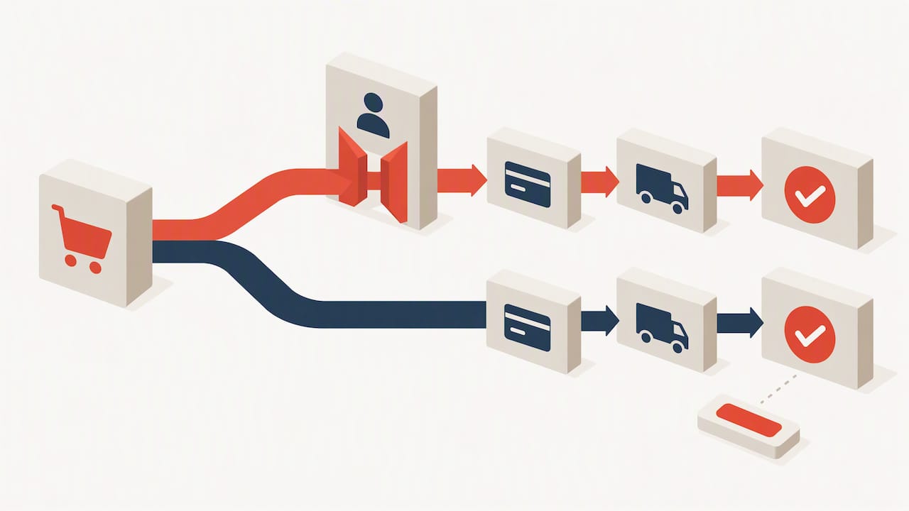
Most teams chase cosmetic polish before they fix the funnel that polish sits inside. A beautifully redesigned button on a checkout page that still forces account creation will not move your numbers; the account gate is the problem, not the button color.
The second common mistake is treating testing as optional. A single sprint of checkout and speed fixes, measured properly, teaches you more than a year of unmeasured redesigns. Keep tests short, keep the metric honest, and resist the instinct to call a result before it has run long enough to mean anything.
On staffing, small teams usually get further handling quick wins in-house (guest checkout, image compression, review placement) and bringing in outside development help for structural rebuilds, feed governance, or a true A/B testing program. The roles are different skills, and mixing them under one overworked generalist is where most conversion programs stall.
— George
Start with an audit, then a focused sprint
We think the fastest path to a measurable lift is the same one covered in this guide: fix checkout and speed first, then layer in trust and testing. Our packages start with a practical audit of your current funnel before any design work begins, so the fixes we prioritize are the ones your own data points to, not a generic checklist.
A typical engagement looks like this:
- Start with a checkout and speed audit against the benchmarks covered above.
- Prioritize three quick wins we can ship in the first two weeks.
- Run a focused six-week sprint covering checkout, speed, and product-page trust signals together.
If your store needs commerce-specific work, our ecommerce packages cover builds from a basic storefront through a full dropshipping setup, each with a published starting price so you know the scope before committing. Reach out through our packages page to get a scoped quote for your store.
FAQ
How do you increase conversion rate in ecommerce?
Start by fixing checkout friction, since Baymard’s research shows checkout design improvements alone can lift conversion by an average of 35.26% on large sites. Pair that with mobile speed fixes, clear product-page trust signals, and a consistent testing habit to confirm what worked.
How can conversion rate be increased on a small budget?
Prioritize free or low-cost fixes first: enable guest checkout, compress product images, and surface verified-purchase reviews you already have. These changes take hours to days and typically cost nothing beyond staff time, unlike a full redesign.
What is a good ecommerce conversion rate?
There is no single universal benchmark, since rates vary by industry, device, and traffic source, so the more useful comparison is your own segmented baseline tracked over time rather than an industry-wide average.
How does mobile page speed affect conversion rate?
Google’s analysis of 37 brands found that a 0.1-second mobile speed improvement correlated with an 8% increase in retail conversion rate, making speed one of the more measurable levers available to a store.
Are fake reviews illegal for ecommerce stores?
Yes. The FTC’s consumer-review rule, effective since October 2024, prohibits buying or selling fake reviews and requires disclosure of any material connection behind an endorsement.
Sources
- E-Commerce cart & checkout usability research — Baymard
- Milliseconds make millions — Google (Think with Google)
- Consumer reviews & testimonials rule: questions & answers — FTC